Pictographs for Class 4 [+12 Practice Worksheets]
This is a comprehensive lesson plan for teaching data handling with pictographs to grade 4 students. The lesson is designed to make the concepts easy and engage students with activities like quizzes, practice questions, worksheets, visual aids like images, videos and real-life examples.
Teachers can use this guide as a reference for delivering the concepts to students and engaging them in the classroom with the various questions and examples given on this page.
For parents, there are 12 downloadable practice worksheets that they can use for their kids.
Pictograph
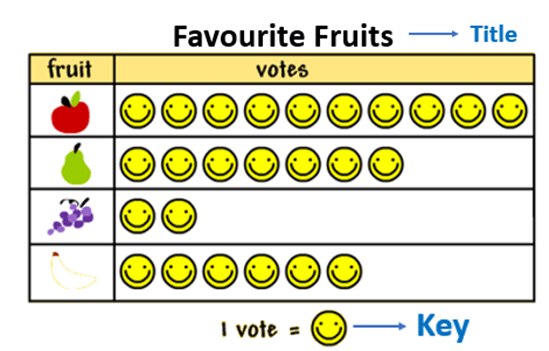
A pictograph is the representation of a set of data using images or symbols. Each image or symbol should be of the same shape and size and also represent the frequency of the object in the set of data.
A key is mentioned in the pictograph which tells us what the image or the symbols represents.
Below are the pictograph images representing the favorite fruits of 30 students, showcasing their preferences in a clear, visual format.

Interpret the Pictograph
-
The title of the pictograph tells us what the data is about.
-
The key represents the data value of each symbol or image.
-
The pictograph image given below shows the data of the number of apples sold in 5 days.
_20250425_114511.png)
From the graph, it can be observed that:
-
Maximum symbols of apples are on Friday. Therefore, a maximum number of apples were sold on Friday.
-
The minimum symbols of apples are on Tuesday. Therefore, a minimum number of apples were sold on Tuesday.
-
The key of the pictograph is: 1 symbol of apples = 2 apples sold.
-
The number of symbols on Monday is 6.
Value of each symbol = 2 apples sold.
Therefore, the number of apples sold on Monday = 2 × 6 = 12 or it can be calculated by adding 2 six times, i.e.,
2 + 2 + 2 + 2 + 2 + 2 = 12 -
The number of apples sold on other days can be calculated in a similar way.
- The fraction of symbol or image can be used to represent the fraction of data value.
Advantage of Pictograph
-
It is easy to read and understand the data.
-
For drawing a pictograph much information is not required.
-
It requires only the information about the object and its frequency to construct a pictograph.
How to make a Pictograph?
These are the steps to be followed :
_20250425_114530.png)
Pictograph Example:
Given below is the data of the favorite subjects of the group of students.
|
Subjects |
Number of Students |
|
Maths |
15 |
|
English |
24 |
|
Hindi |
6 |
|
Science |
21 |
Draw a pictograph to represent the data and answer the following question:
-
Which subject is liked by the maximum number of students?
-
Which subject is liked by the least number of students?
-
How many more students like science than Maths?
Solution:
The pictograph is:
_20250425_114552.png)
-
The graph shows that the maximum number of students liked English.
-
The graph shows that Hindi is liked by the least number of students.
-
Number of students who liked Science = 21
Number of students who liked Math = 15
Subtract 15 from 21 to get the difference.
21 – 15 = 6
Therefore, 6 more students liked Science than Maths.

Watch Orchids' video on Pictograph
Quiz:
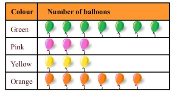
1) The following pictograph shows the number of balloons liked by students.
How many orange balloons are liked by students?
Take a look at the Pictograph given below:

A. 3
B. 7
C. 8
D. 6
2) The following pictograph shows the different modes of transport used by the students of a class to go to school.
How many boys use cars to go to school?
.jpg)
A. 2
B. 3
C. 8
D. 6
3) The favorite colors of students of classes VI and VII of a school are shown by the following pictograph. How many students like the color red?
_20250425_114656.png)
A. 30
B. 33
C. 36
D. 31
4) Which instrument is the favorite for only one student?
_20250425_114734.png)
A. Violin
B. Guitar
C. Piano
D. Trombone
Bonus Question:
A pictograph showing the number of toys each child has. If each teddy bear picture represents 1 toy, the pictograph might look like this:
- 🧸🧸🧸 for Sam (3 toys)
- 🧸🧸 for Mia (2 toys)
- 🧸🧸🧸🧸 for Leo (4 toys)
- 🧸 for Ava (1 toy)
Questions:
-
How many toys does Sam have according to the pictograph?
-
Who has fewer toys, Mia or Leo?
-
If each child gets one more toy, how many toys will Mia have then?
Frequently Asked Questions
1. What type of data is used for a pictograph?
Answer: A pictograph shows data using pictures or symbols. Each picture stands for a specific amount, making it easy to understand and compare information.
2. What is the purpose of pictographs?
Answer: Pictographs use pictures to display data. They are simple to understand but may not show exact numbers clearly, so they need to be used carefully.
3. What is the main advantage of a pictograph?
Answer: Pictographs are easy to read and make large amounts of information simple to understand. They show data at a glance and are easy for everyone to follow.
4. What is an example of a pictograph?
Answer: For example, one apple icon might represent 10 apples bought. This helps you quickly see which items are more popular without reading long lists of numbers.
5. Why use a pictograph?
Answer: Pictographs help young learners connect objects with numbers. They make data visually interesting, easy to understand, and great for showing large amounts of information.
6. What is a Pictograph Chart?
Answer: A pictograph chart uses pictures or symbols to represent data. Each picture shows a certain number, as explained in the key.
Practice Worksheets
Click the below links for worksheets to follow:
Easy Level Worksheets
Intermediate Level Worksheets
Advance Level Worksheets
Orchids' Learning Material
Click the button to download the e-book
Things you have learned
- Pictograph definition and its interpretation.
- Advantages of a pictograph
- Steps to create a pictograph with an example

